
@ubruhin
September 12, 2025
I’ve made a lot of progress with the completely new user interface for LibrePCB 2.0 and am very excited to share some insights how it will look, and how it makes LibrePCB better in many ways.
The Original Problem
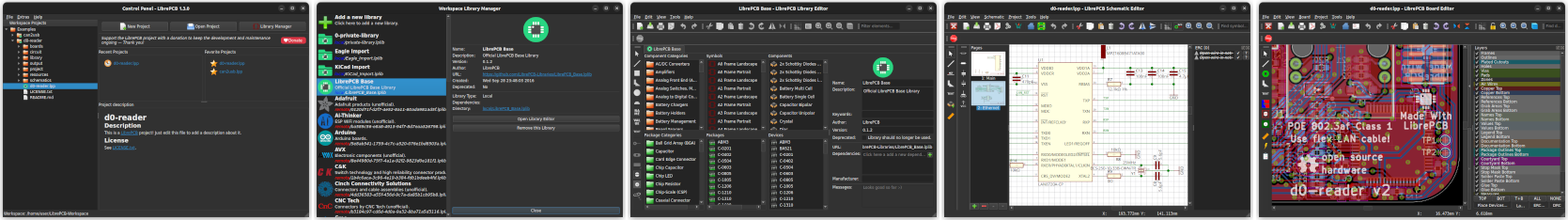
First, let’s quickly look back how everything began. Since the early days of LibrePCB around 2013, we are using Qt as the UI toolkit and the concept was to implement every editor as a separate window (schematic editor, board editor, library editor etc.):
But with more features added over time, the UI got more and more cluttered. Also the paradigm of separate windows is often cumbersome to work with — e.g. having just one library and one project opened required to constantly switch between four(!) windows. Even a dual-monitor setup was not enough to work efficiently with LibrePCB. So it was clear we need a completely new organization of windows and editors. Generally we could have done that with Qt, but its traditional approach makes is really hard to pursue more modern UI paradigms, not to mention the effort and the error-proneness it involves. In the past I have struggled many times with Qt to create nice UI elements, thus I didn’t feel confident to build up a completely new UI with Qt again.
Slint: A Declarative UI Language
In the blog post NGI0 Grant for LibrePCB 2.0 I listed a few possible solutions how to build a more modern user interface. The most promising option was Slint, a relatively new UI toolkit (open-source & written in Rust) which uses a custom, declarative language to describe the UI. With the declarative approach, relations and behavior can be easily specified right in the UI description:
Window {
    Button {
        x: parent.width - self.width - 5px;  // place 5px from the right border
        y: 5px;                              // place 5px from the top border
        text: @tr("Open Project");
    }
}
It may sound trivial to place a button at the top right corner of its parent, but with the procedural approach of Qt this is often not trivially doable. In many cases, it requires to implement event handlers in C++ which update the widgets position whenever the parent object’s size or the widgets’s own size has changed. Writing such code is time-consuming and error-prone, while the declarative approach of Slint is quick, easy and safe — not just for this trivial example, but also in more complex cases. For a large project like LibrePCB, which consists of hundrets of UI elements, the declarative approach is really a game-changer for us developers! (Side note: As of today, LibrePCB contains 23.746 lines of Slint code!)
An Incremental Migration
Unfortunately, even with several months of full-time work, LibrePCB is too large to be migrated to Slint by 100% at once — to avoid delaying the next release too much, we need to do the migration in steps. All the main windows & editors first, and the remaining dialogs and wizards in later releases. Also our whole business logic depends on Qt (it is much more than just a UI framework), thus our dependency on Qt will remain for a long time.
So the question is, can we mix Qt with Slint? In the end, LibrePCB only works if the main thread is running Qt’s event loop. But Slint only works when the main thread is running their event loop. So at first glance it seems we have a very bad conflict here :-/
In fact, Slint supports different backends for interaction with the underlying system, e.g. for input events handling and window drawing. These are (interestingly) Qt, winit and LinuxKMS. Winit comes with the ability of GPU-accelerated rendering, which would be interesting for performance reasons. But unfortunately right now we can’t use winit because of the event loop conflict.
Luckily Slint’s Qt backend avoids that problem since Slint will run Qt’s event loop for us. So the event loop will process the events for both, the Slint UI and the LibrePCB backend. This works because Slint and LibrePCB are compiled and linked against the same Qt library. It also allows us to mix the new Slint window with legacy Qt dialogs & wizards, so we can do a step-by-step migration.
One Window For Everything
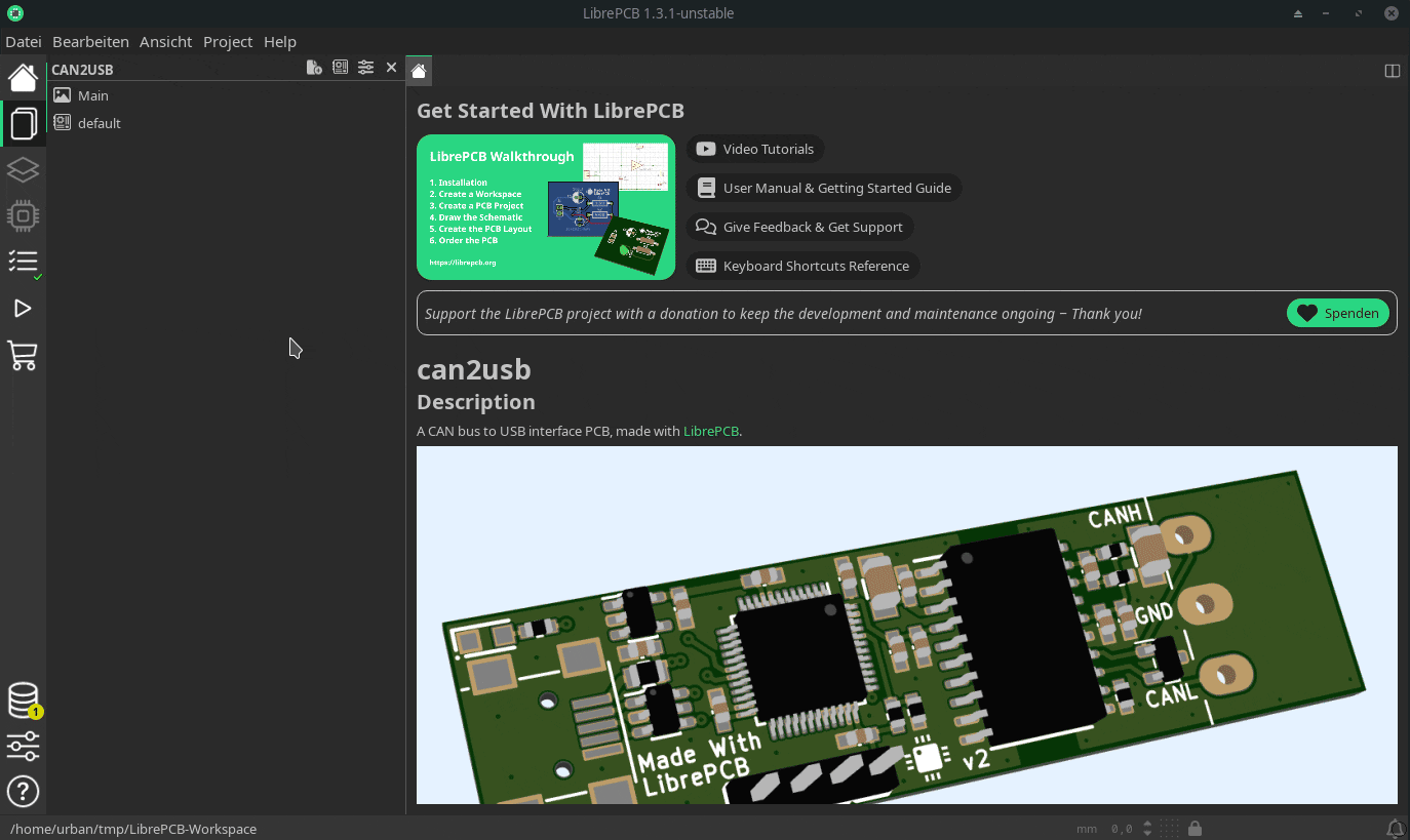
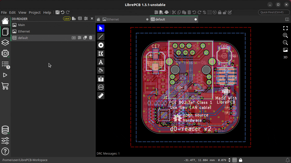
Enough background information for now, let’s have a look at the new UI of LibrePCB 2.0. The most important thing is that all the individual windows mentioned above have been replaced by a single, multifunctional window. Within that window, any kind of "document" (e.g. a footprint, a schematic or a board) is opened as a tab. The toolbars of the new window now depend on which tab is currently active, because for example the footprint editor supports other features than the schematic editor. This is how the new window currently looks like:
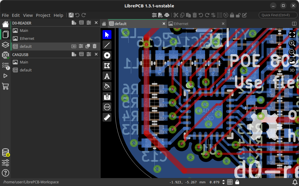
By the way, in this new window you can even have multiple projects (and libraries) opened at the same time! All the opened projects and libraries are listed in the documents panel, and the contained entities can be opened as individual tabs.
Sidebar & Panel
A lot of functionality is accessible through the new sidebar. Depending on context, there are different kinds of panels available. For example if you’re working on a schematic, there is a panel which displays ERC messages. But if you’re working on a board, that panel will display DRC messages.
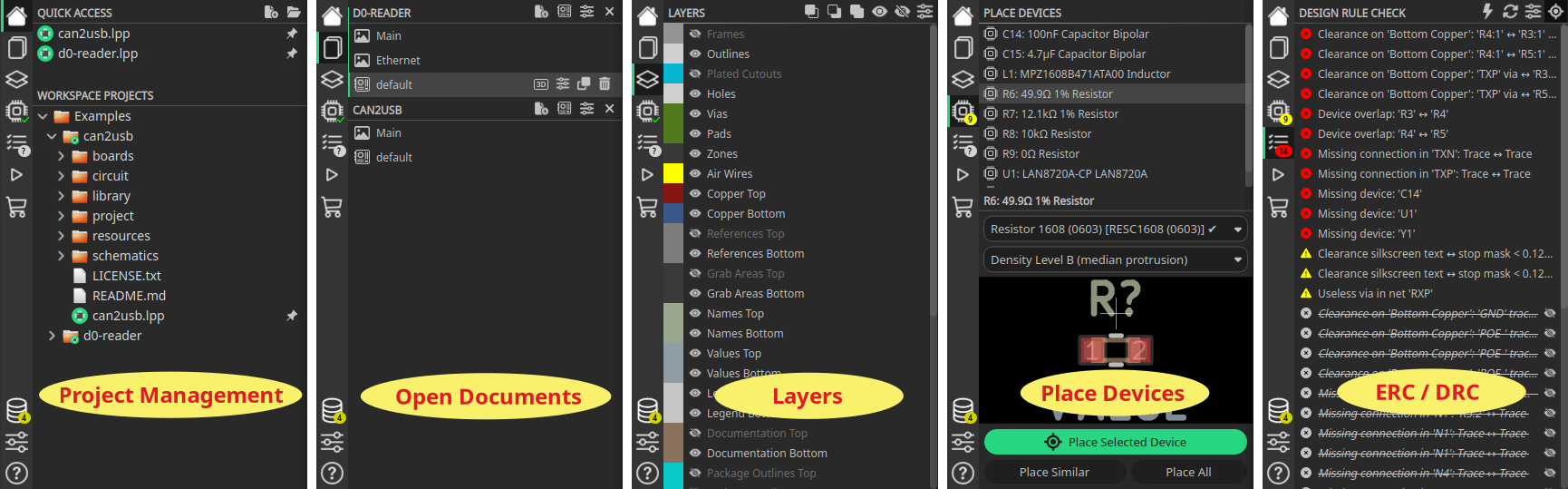
The sidebar also shows you status information about various parts of the application. For example you see if there are ERC warnings or outdated workspace libraries without even opening the corresponding panel:

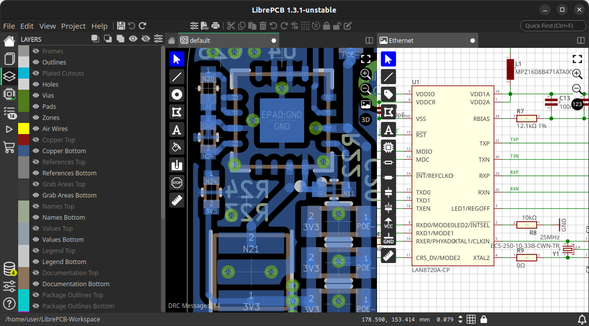
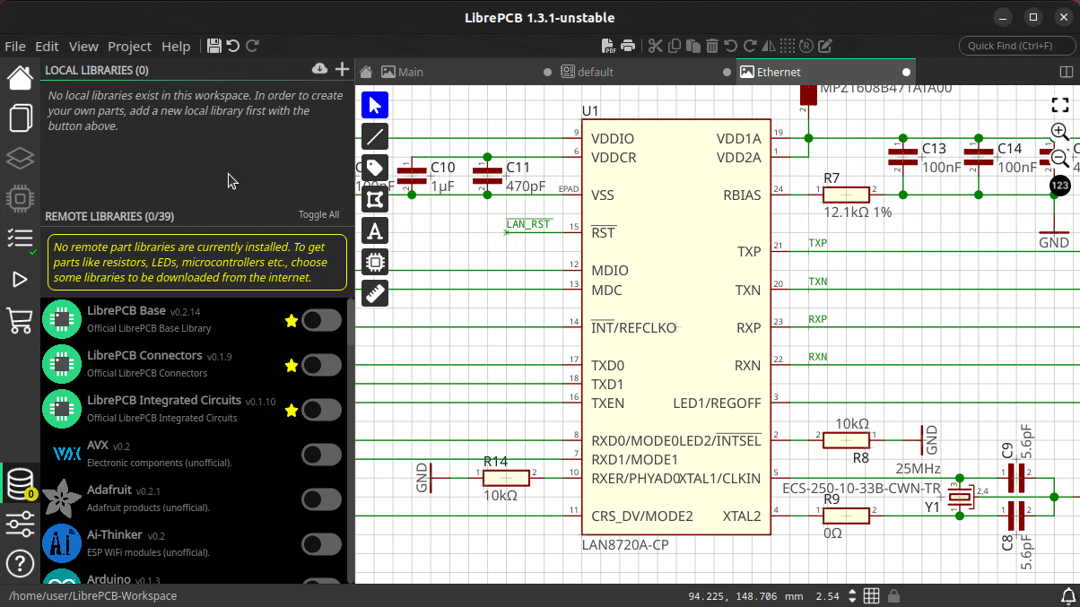
Working Area
The most important part of our UI is of course the working area where you draw schematics or layout traces etc. This area has been improved in many ways. Not only that everything is now a tab (remember that schematics were not tabs in the old UI), you can now even split the window into multiple sections and open tabs side-by-side. For example if you’re working on a single-monitor setup, it is now easy to work on the board while still having the schematics in sight:
Tabs and sections can be easily arranged by drag&drop — see it in action in this video.
In addition, the working area has been maximized and decluttered to have as much of the screen size available for the graphics view as possible. For example, tool buttons are now overlays inside the editors rather than traditional toolbars spanning the whole window height or width even if only a third of them is filled with buttons. There is no such wasted space anymore in the new UI.
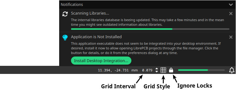
Statusbar & Notifications
We already had a status bar in the old UI, but it was purely visual and not interactive. Instead of just displaying the grid interval, the new UI allows you to modify the grid interval and the grid style right in the status bar — no dedicated dialog window is required anymore. Also the state of placement locks is displayed and can be toggled right in the status bar. Last but not least, there is a completely new notification system which displays messages and ongoing operations in an expandable/collapsible popup in the bottom right corner:
Multi-Monitor Ready
If you are working on a multi-monitor setup and now worry that a single window is worse than the multiple windows we had before — of course this use-case is covered as well. Although the new window replaces all the old windows, I have implemented the ability to open multiple instances of that window at the same time. So you decide whether to display schematic and board side-by-side by splitting a single window, or by opening schematic and board in entirely separate windows — everything is possible with the new concept!
Simplified Library Management
The old library manager was not that bad, but it was more complicated than necessary due to its "operation-based" workflow of manually triggering the installation or uninstallation of libraries, with those operations even spread across multiple list views and pages.
The new library manager is much simpler (but as functional as before) by following a "state-based" paradigm now. Instead of triggering the installation or uninstallation of individual libraries, you now just check the libraries you like to use (or uncheck those you don’t want anymore) and a single apply operation performs all the necessary installations or removals at once. Beside the improved user experience, this also fixes some issues of the old concept (e.g. limitations of the automatic dependency management).
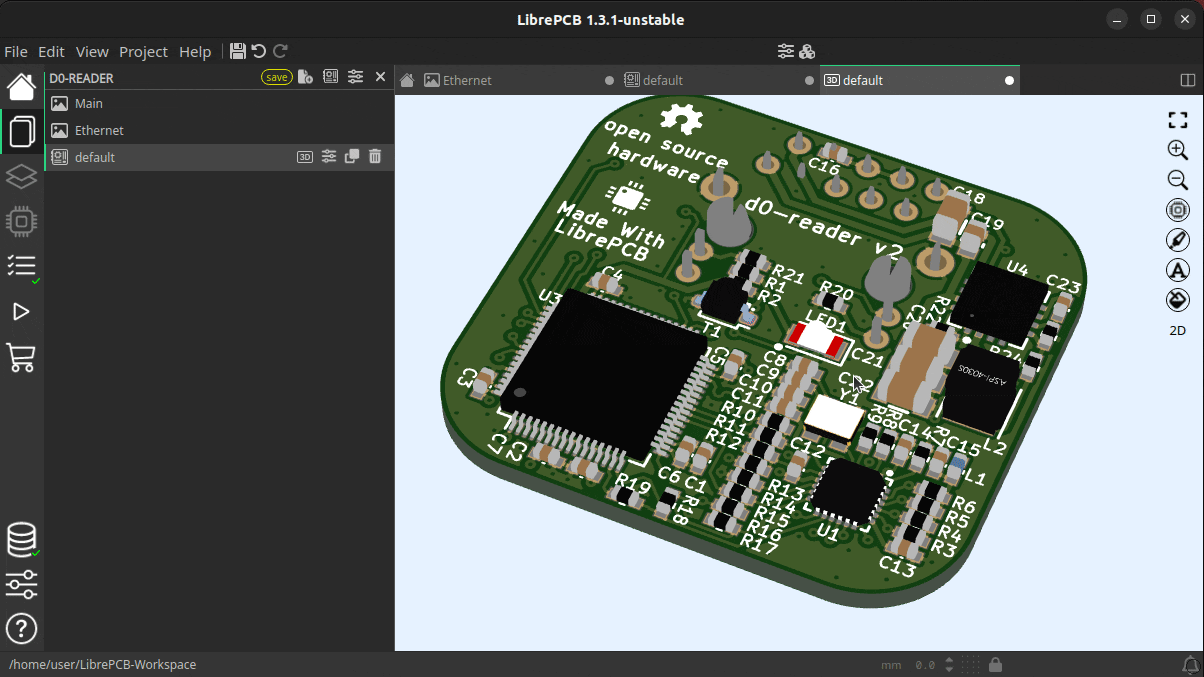
Configurable 3D View
The old 3D view was just a pure read-only display with no configuration options at all. But for a detailed review of the design, sometimes it is necessary to hide specific things — e.g. the devices or the solder paste. This is now possible by changing the transparency of those objects:
Built-In Hints, Tips & Guides
In my vision, an EDA tool should support engineers/makers as well as possible (in a non-disruptive way) to help them creating PCB designs without errors as quick as possible. The new UI has therefore various new tips & hints implemented which show up in certain situations. Many of them are especially useful for LibrePCB beginners to ensure a smooth first-use experience, but some are useful for everyone to minimize errors or wasted time.
As an example, the built-in PCB ordering feature now displays the state of the electrical- & design-rule checks as a friendly reminder to review & fix any issues before ordering a (possibly faulty) PCB. The order panel contains direct hyperlinks to the ERC & DRC panels, and even allows to run the DRC right from the order panel. And as an additional psychological effect, the order button is only highlighted if there are no issues, though it is always clickable. 🤓
What’s Next?
Even though the new UI is the biggest change in the history of LibrePCB, this is just the beginning of a new user experience. There is still a lot of room for improvements which we will take care of after the LibrePCB 2.0 release. Just a few examples:
-
Object property editors (incl. multi-object editing) in side panel to get rid of modal dialogs
-
Replace remaining modal dialogs & wizards by integrating them as tabs or lightweight popups
-
Reflect typical workflows by the UI, for higher productivity and intuitivity
-
Productivity improvements, e.g. drag&drop, more keyboard shortcuts, hints, links to docs, …
-
Theme improvements / cleanup / polishing, maybe some day support customizable themes
All the completed tasks and the planned tasks, together with more details and previews of the new UI, are summarized in this issue. Of course there are also a lot of new non-UI features beeing developed for LibrePCB 2.0 and beyond, those are tracked in separate issues. This blog post just focused on the UI things due to its huge relevance in this moment.
Give it a Try!
If you like to try out the new UI already, we have nightly builds available
here.
In contrast to the current master branch, these builds still use the stable
file format 1.0 so no changes will be made to your library- and project files.
But of course there might still be some bugs — if you experience any issues
or annoyances, or have any other feedback, please
let us know!
Btw, if you are curious about the timeline of the LibrePCB 2.0 release: There are still some new features to be implemented (mostly non-UI things now) and it is hard to say when they are finished. But roughly I’d estimate it should be ready in around 2-3 months. If you like to support my work on the LibrePCB project, any donations are highly appreciated and help me to keep the development ongoing.
Credits

A majority of these updates were part of the NGI0 Commons grant we receive from NLnet, thanks a lot for their support! Also a special thanks to the Slint developers who helped me with support, feature development and bugfixes during this migration.